Altri
Lets make every
workday count!


Lets make every
workday count!
Altri is a portable workspace system that helps the user’s optimize their productivity and creates a tailored workflow based on the user’s patterns and needs. Altri transforms into its space, acting as a work pad or a partition,using visual cues to notify the user when they are being distracted from their work or when they need to take a break.
Altri aims to aid the modern day worker in making each and every work day their best. Much like our users Altri is multi-functional, serving as a smart fold and productivity app that improves and tracks user productivity. Altri transforms into its space, acting as a work pad or partition, using visual cues to notify the user when they are being distracted from their work or when they need to take a break. Altri helps create an efficient workflow personalized by each user's needs and goals. By creating an efficient workflow and a set space to work, users are able to work more productively in shorter increments.
Due to the Covid-19 pandemic 42% of the US labor forceis now working remotely causing workspace and flow to drastically change.
Right now the modern day worker struggles with the physical and mental separation of work and play, causing stagnation in productivity.
The work environment has been rapidly evolving, shifting towards a more remote structure. As the daily work environment continues to evolve and find a new normal, remote workers must also find a new normal when it comes to productivity. Currently, remote workers struggle to create physical and/or mental boundaries between work and play within their living spaces, threatening the likelihood of highly productive days.
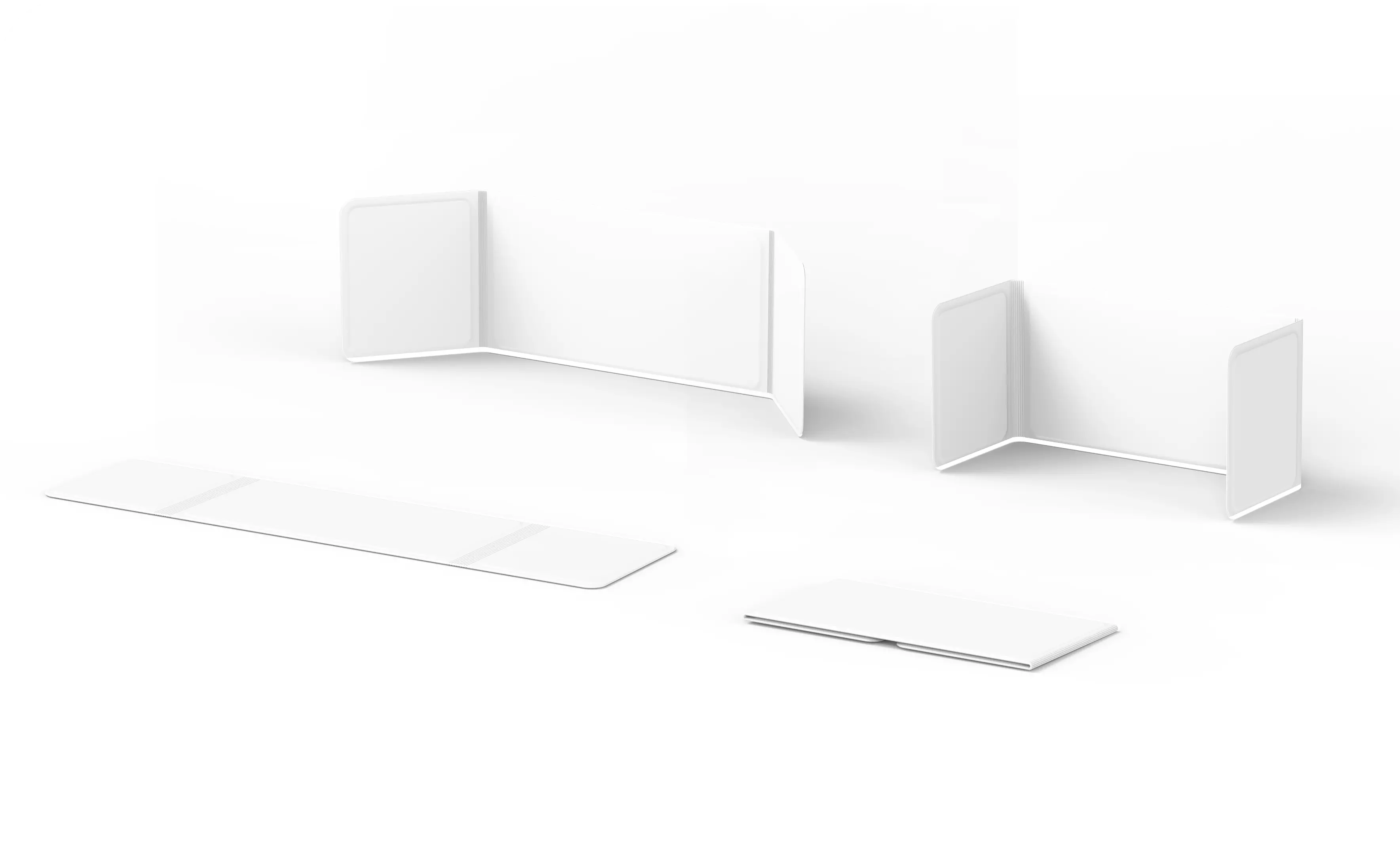
Altri was made with the modern day worker in mind, being versatile enough to fit any work space. The Altri fold is portable and convenient; so you can work anywhere anytime. Altri can be used horizontally as a desktop- with magnets and a comfortable work surface, the fold is suited for adaptability in workspace size and location. Finally, Altri can function as a partition between you and the distractions of open workspaces
Altri helps everyday workers find the best work flow based on their answers during on boarding. Altri analyzes your answers and matches with you a wo The Altri fold provides a physical barrier between the user and outside environmental stimuli, creating a sense of privacy and personal space. This helps everyday workers create a separation physically and mentally from their living space all while lower outside distractions.
Altri provides privacy and freedom for the user to work in a larger, more spacious area without distraction. Workers value large spacious areas while working, but oftentimes do not have private access to such space. The Altri fold provides a physical barrier between the user and outside environmental stimuli, creating a sense of privacy and workplace comfort.
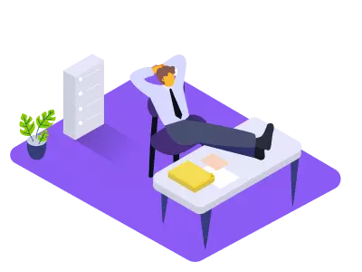
Promotes focus through the use of external cues that let the users know when they have reached their goal and it is time for a break. This prevents burnout and overworking that affects not only the users work but also mental health
Foldable for easy portability and set up in any environment. The Altri fold is equipped with magnetic inner boards to hold paper and other work materials to provide even more ease during transportation.

Altri Fold
If we didn't bring work home before, why should we have to now?
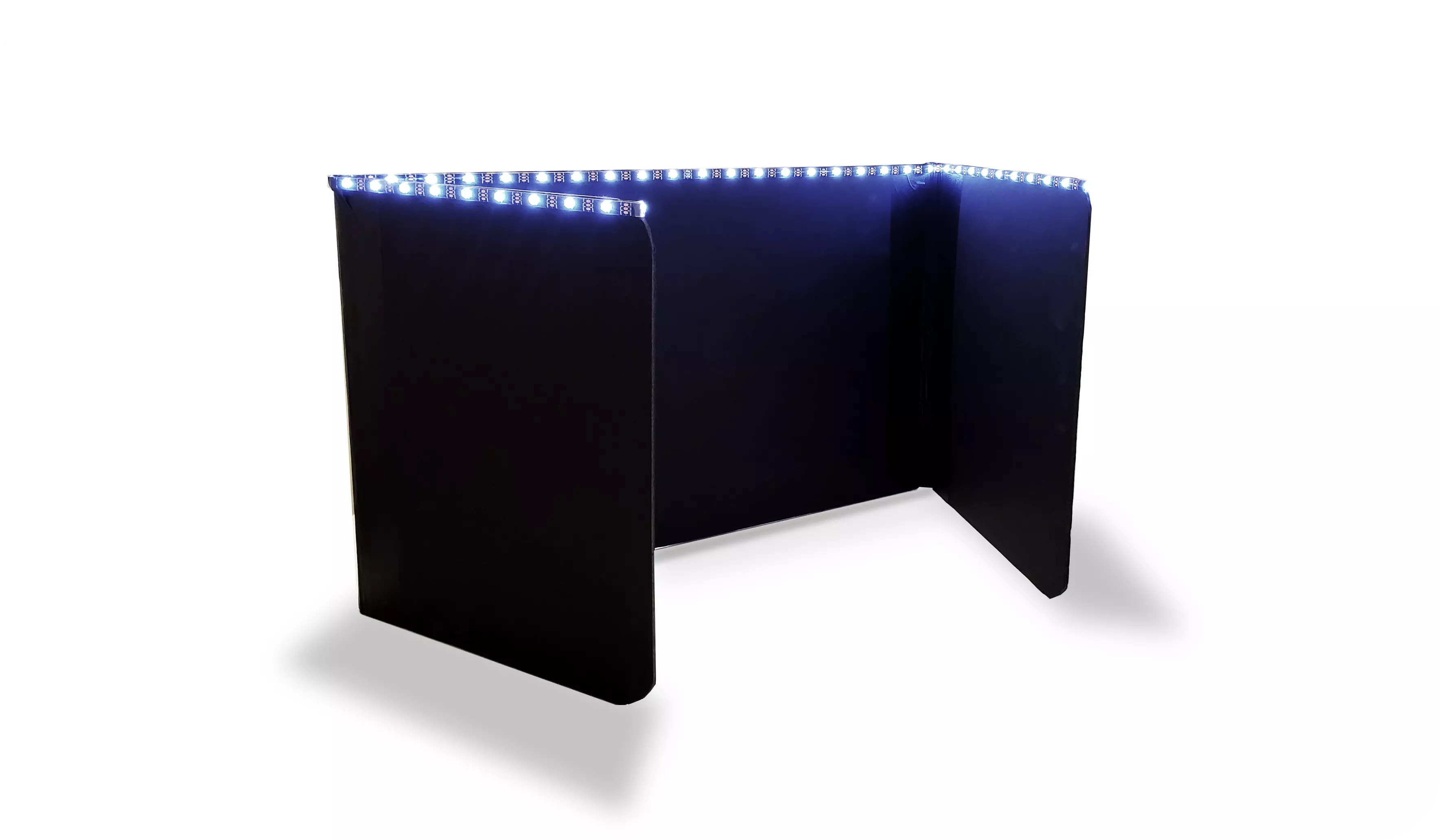
The Altri fold is a four panel foldable smart divider. Equipped with a light notification system the Altri Fold has customizable LED lights on the upper portion. The fold is designed to be portable, small enough to fit in a backpack or be carried like a laptop, being able to fit any work space anytime anywhere. Altri can be used horizontally as a desktop - with magnets and a comfortable work surface. These magnets are to ease in workspace transportation, allowing the user to conveniently fasten papers and fold their Altri to easily move to their next location or change its orientation. The Altri fold can also function vertically as a partition between you and the distractions of your workspace. When the pad is active it will be communicating with our partner app to track your productivity helping you monitor work and break times based on your personalized work flow.
Personalized Workflow
Its important to find a workflow that works best for you and your goals.
Creating the best workflow for each user means personalization. During on-boarding, the altri app analyzes your answers to help you form and understand a workflow that works best for you and will optimize productivity.

Productivity Tracking
Track your productivity and reach your goals.
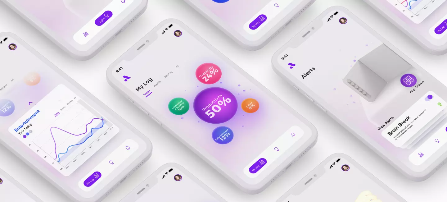
The Altri ecosystem allows the user to track, monitor and reflect on their daily, weekly, monthly and yearly productivity. This allows users to visually see their productivity level and evaluate distractions and set alerts to optimize their work days.
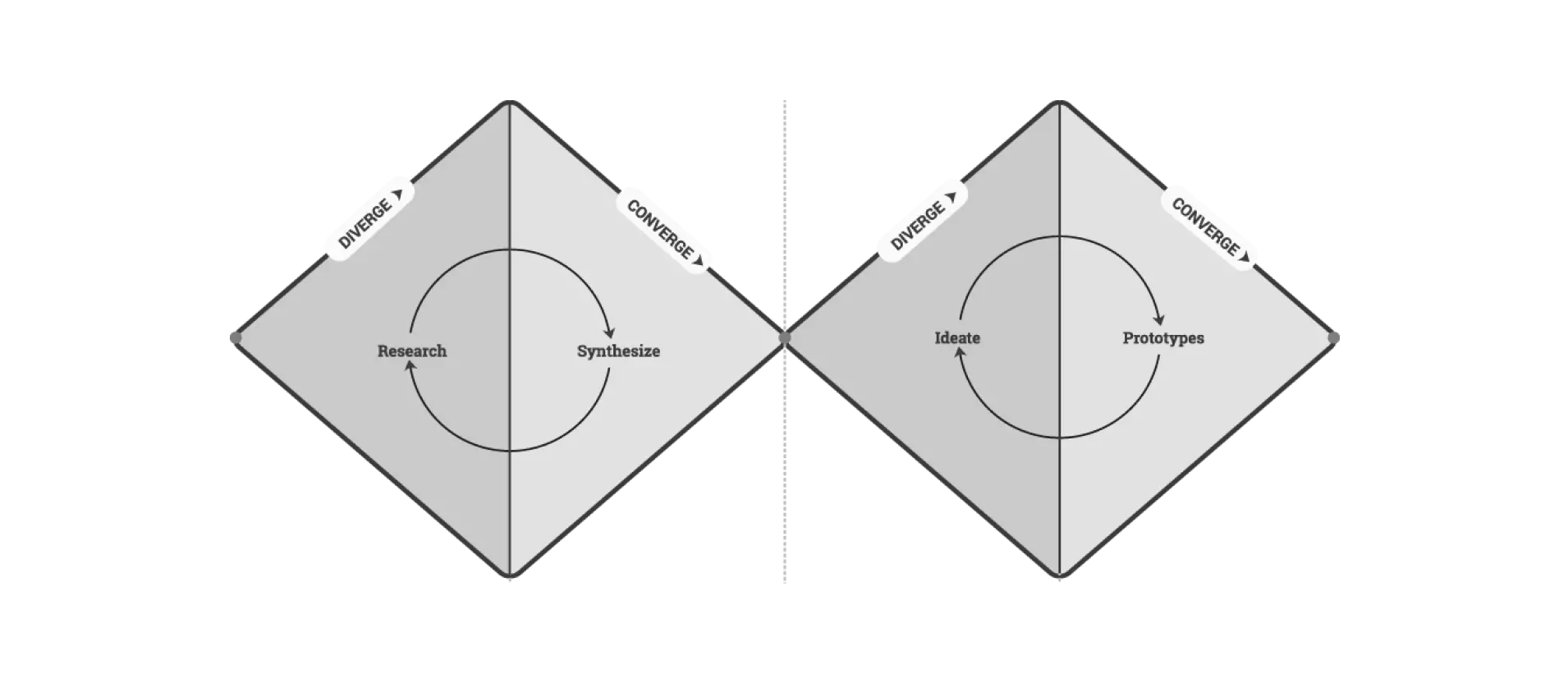
Problem Statement - Our problem statement derived from the current pandemic and my teams shared difficulties working from home. This project took place at the beginning of the Covid-19 pandemic when the nation was fully remote, which made our homes our new offices.
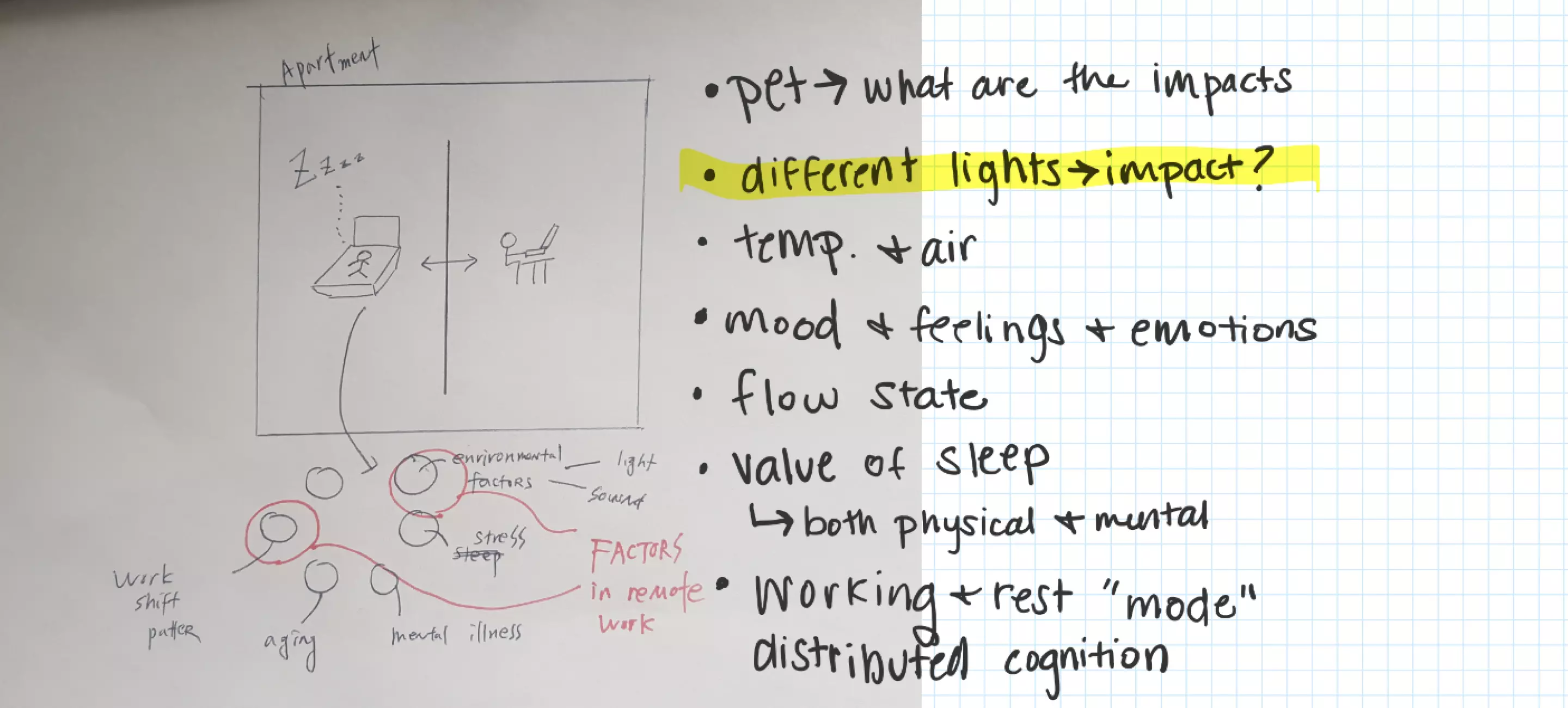
Research - We conducted two weeks of various user research methods. Through these methods we managed to understand behaviors, draw user insights & findings, all to create our design framework.
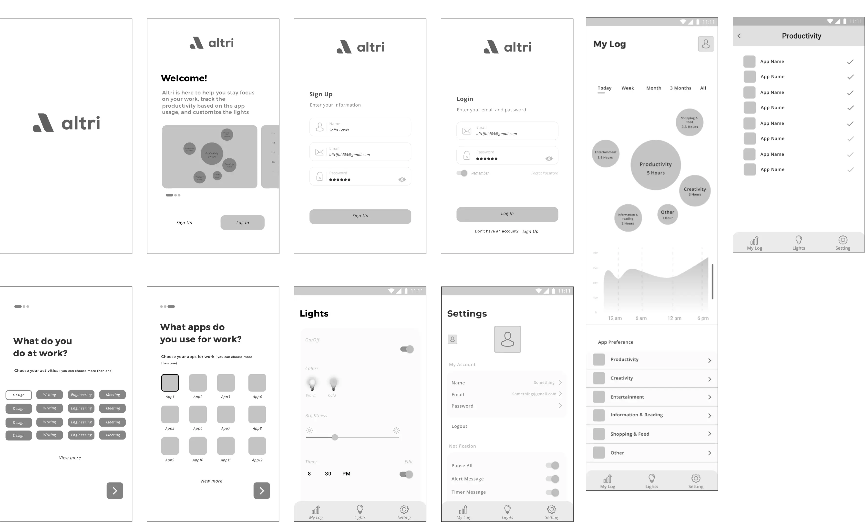
Prototyping -We began our development with wire frames and deep diving into user flow, information architecture and site maps. These various elements were then used to evolve into a physical product and app low-fi, followed by mid-fi and high-fi deliverables.
Evaluation - We conducted user testing throughout our development process, evaluating and evolve our physical device and app throughout.
In summary...
We began our research phase with a online survey. We received 169 responses. Our goal for our survey was to gain insight on how workers are adjusting to the remote working environment and what struggles they have been
facing. We used these user feedback to solidify our design direction.
As a team we each conducted several cultural probes with users aged 20 to 45 who are currently working remote, in total we had 11 participants. Our cultural probe consisted of a short packet of questions and drawing prompts for each participant to fill out. Our aim for our cultural probe was to find the reoccurring environmental aspects of the spaces people are working in.
We then wanted to take a deeper dive into our target audiences daily routine and their work environment through user observation. Since this research took place during Covid-19 lock down we conducted all observations via video call. We had each participant set the camera up and then go along with their work day as usual. Our main goal was to establish patterns assessing what is users value the most in a quality work day.
Key Take-aways
Enjoyment of space and privacy - Users enjoy having large amounts of space to work in but also value privacy and productivity.
How might we create a workspaces environment that promotes comfort and productivity?
Importance of environmental factors - Users value having their workspaces in an area that offers different environmental factors than the rest of their home.
How might we create and environment that is ideal for work but offers non-distracting stimuli?
Frustration of staying stagnant - Users grow tired of staying in a stagnant environment for the majority of their work days.
How might we allow users to easily seamlessly move workspaces both inside and outside of the home?
Lack of structured workflow - Users value having structure but find it difficult to keep their work and personal lives separate while working from home.
How might we promote the separation of work and play to improve users health and overall productivity?
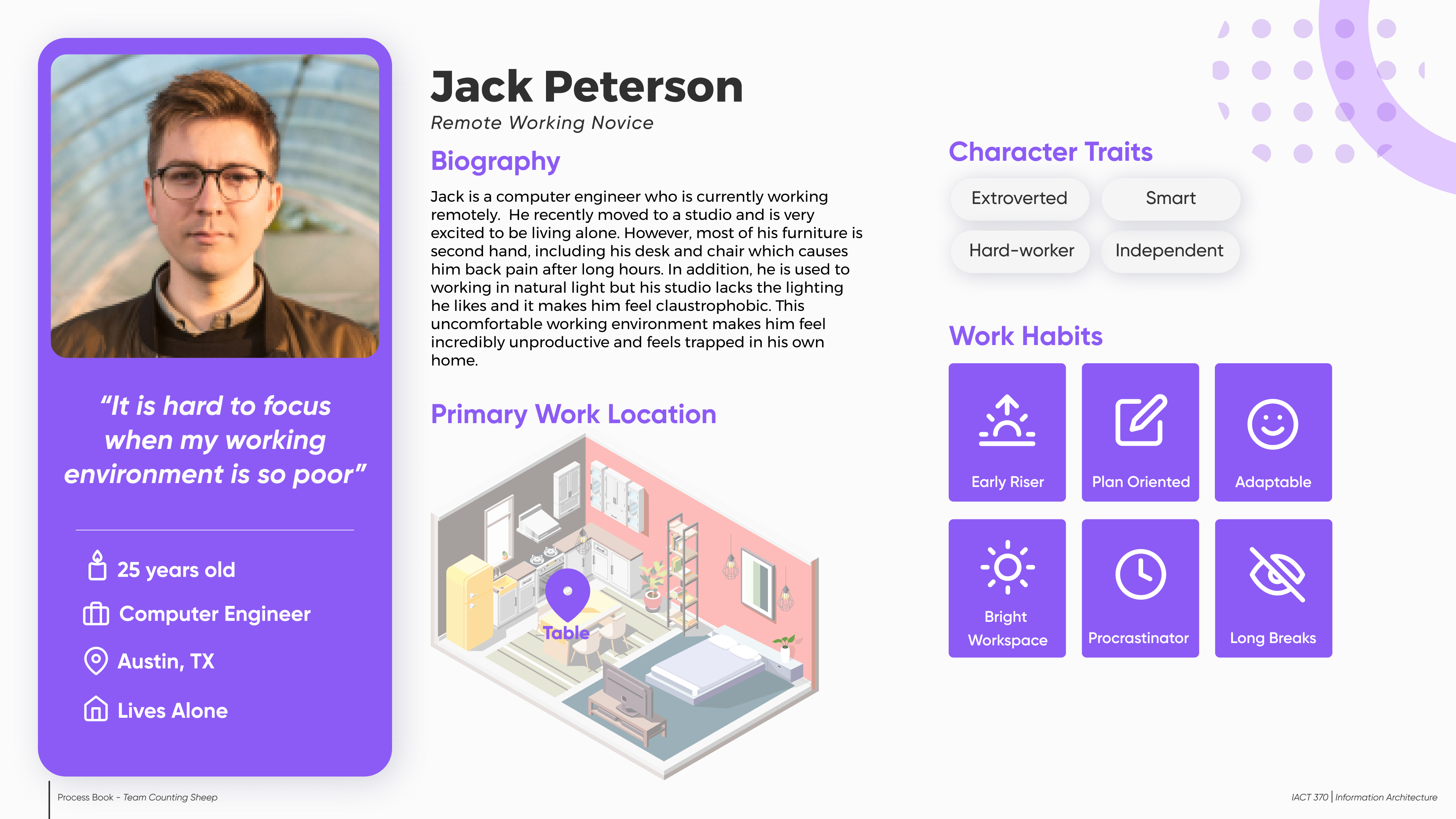
User Personas
Informed by our research, we created two personas to represent our main users, their needs, frustrations and goals.

User Journey Maps
Informed again by our research and our understanding of our personas we created two journey maps to represent our users.


Site Map
Our development process began by creating a basic site map to understand structure. We focused a lot on developing the user flow and creating a solid information architecture.

Low - Fi
Once confident in our site map I then began to create a low-fidelity prototype.
Key Take-aways
Mid- Fi
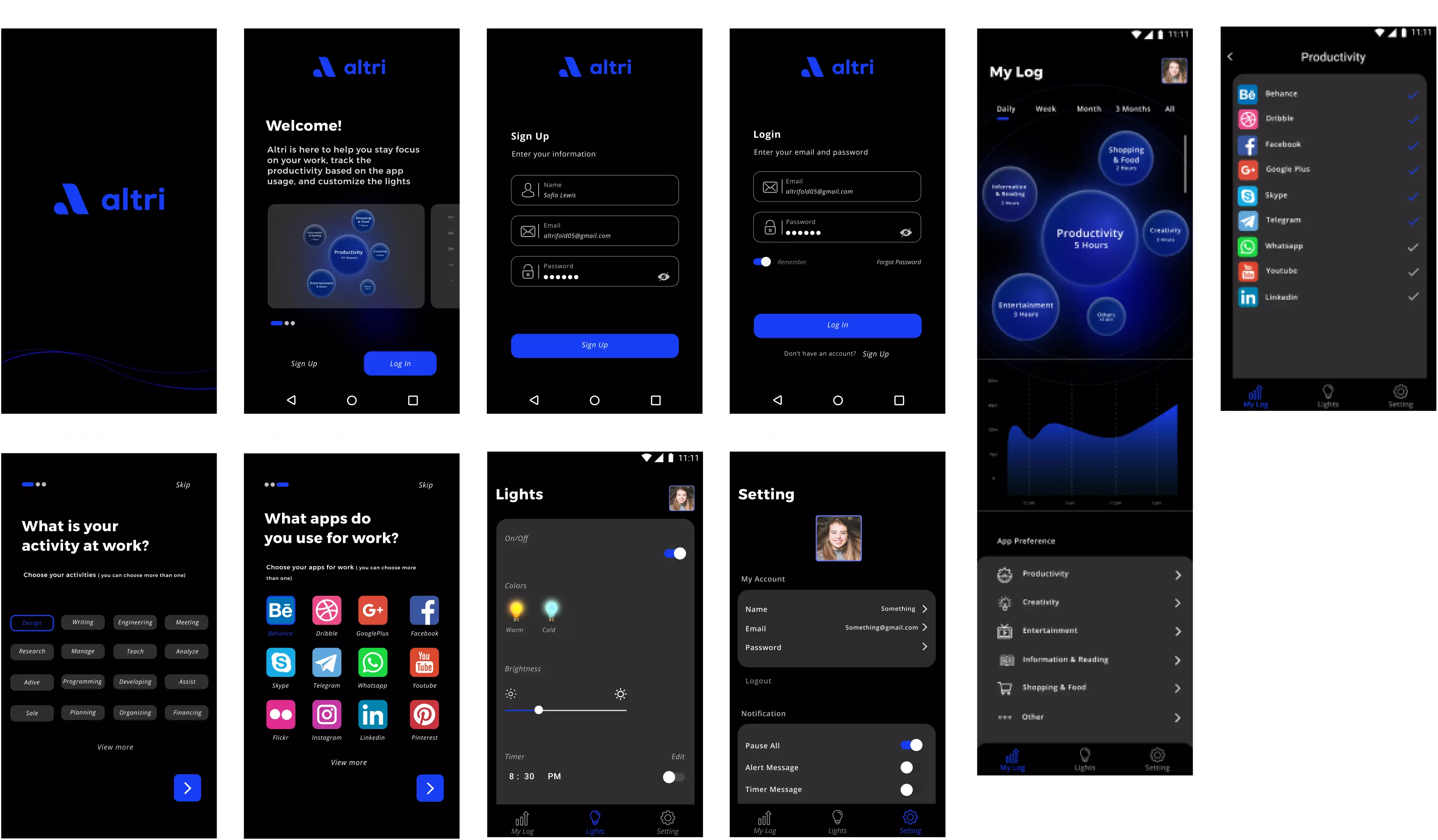
Evolving from our low-fidelity and the feedback we as a team received we began creating our mid-fidelity prototyped which we then user-tested on a large scale.
Key Take-aways
What does work...
What does NOT work...
High- Fi
Based on our user testing we created a game plan to easily transition into our high-fidelity app prototype development.
Key Changes

Interaction Map
Defining the interactions between user, Altri Fold and the Altri App.

Altri Interface
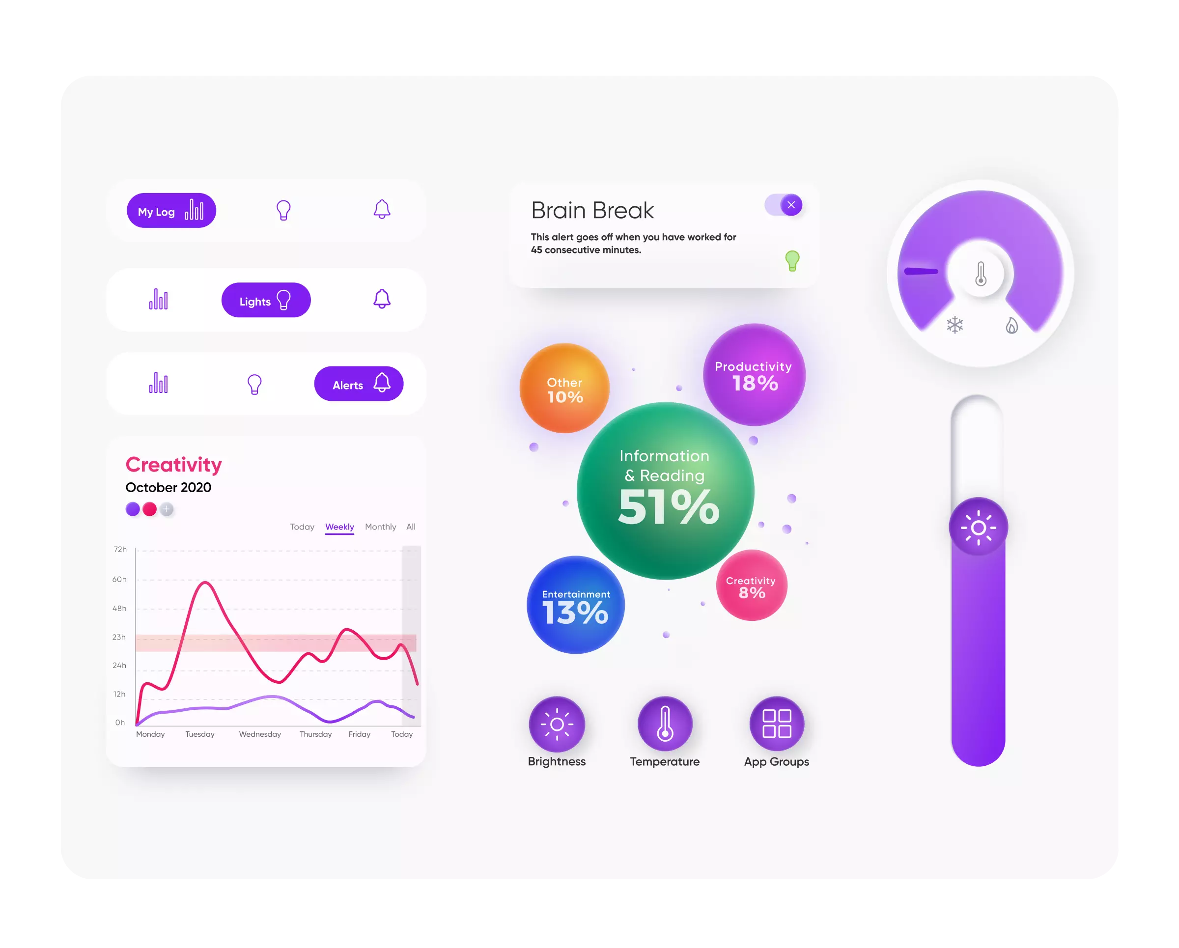
TThe idea for Altri's interface was to design something that aligned with our modern interactive world. By creating the floating 3-Dimensional visual comparison circles, the viewer can have a sense of interaction with their
productivity allowing them to connect to something that is more than just a percentage. I wanted to create something that signified our non-stagnate continuous moving workdays, this can be seen in the responsive percentages
as they continuously move on the home screen
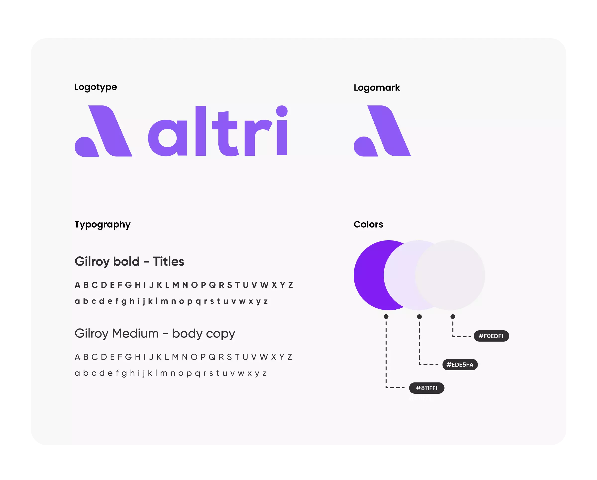
Altri Branding
To read more in depth about each step of the creation of Altri visit our process book!

Information Architecture
Professor Sung Park
10 Weeks
09.14.20 - 11.19.20
Jonathan Sanchez
Maddy Esper
Hagar Baruch
Jiyoung Lee
Taylor Primuth
Visual Design Lead
UI Designer
Vision Video Strategy